serena zhang
graphic design 2

01
Looplet
11 x 17 in; Adobe Illustrator
In this project, I created my own font using an earring hook as inspiration. Each part of the letter was created using the pen tool and direct selection tool. The color harmony of the design is complementary: purple and yellow. I chose to name the font "Looplet" because of the little loop on each of the letters, which acts as a serif. I created the name of the font so that it looks like an earring by attaching it to an ear and making the color gold.
This was displayed at South Coast Plaza for OCArts4All, Laguna Festival of Arts, and entered into the TACFA contest.
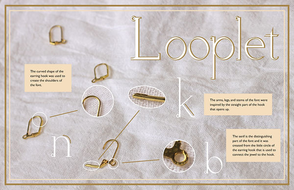
02
Font Infographic
%20(1).jpg)
This project was an infographic that showed my inspiration for my own font. It shows which parts of the earring hook I used for different parts of my letters.
11 x 17 in; Adobe Illustrator, Photosthop
-02.jpg)
03
Yes - Owner of a Lonely Heart
8.5 x 11 in; Adobe Illustrator
This project was inspired by the 70s band Yes. One of their songs is called “Owner of a Lonely Heart”, so I made the main focus of the project a heart lollipop with warped text inside reading “Lonely Heart.” On top of the heart is the band’s name. I used a monochromatic color harmony.
This won semifinalist for the Vital Link art contest.
04
Banff, Canada
5 x 7 in; Adobe Illustrator
This is a postcard of a place I went to in summer: Banff, Canada. Specifically, the place is Lake Louise. I played around with multiple layers, changing the opacity, and making the background as simple as possible. I used a complementary color harmony (blue and orange). I chose to make the canoes orange to make them stand out against the cool-toned mountains and lake.


.jpg)


05
Woodblocks
2 x 2 in; woodblock, laser-cutter
I created original Chinese cultural patterns. Then I used a laser-cutter to make woodblocks that can be used to stamp these patterns onto different mediums.
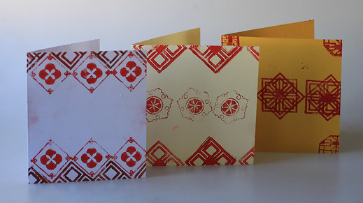
06
Cards
10 x 6 in; stamps, paint, cardstock
I used the woodblocks from the previous project to make cards for my family and friends. I stamped the woodblocks onto cardstock to create even more patterns.
.png)
07
Self-Portrait
8.5 x 11 in; Adobe Photoshop
For this project, I created a self portrait, with a cultural background. The background was made through designing a pattern on illustrator, laser cutting it onto a woodblock, stamping it with red paint onto a piece of paper, scanning it onto the computer, then warping it using Photoshop layer masking and blurring effects.
08
Typography Vocabulary
11 x 8.5 in; Adobe Illustrator
This project demonstrates the different parts of a letter, such as the descenders, ascenders, spines, etc in an infographic. I used a mix of a script font and a serif font.


09
1950s "S"
3 x 3 in; Adobe Illustrator
In this project, I used the letter "s" in a combination of different fonts and colors to create an interesting composition that was in a 1950s style. I used a pastel color palette from the decade.
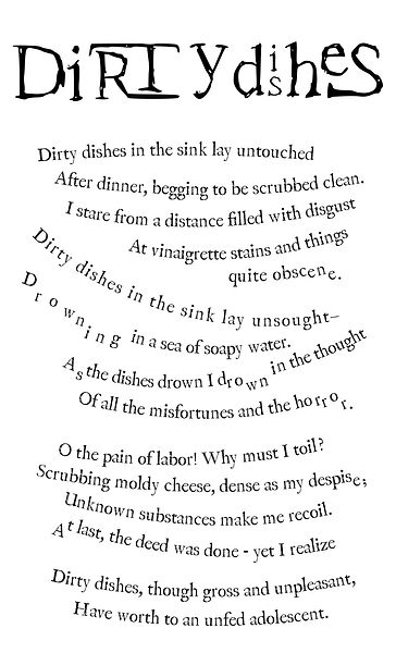
10
Typography for Poem
8.5 x 14; Adobe Illustrator
"Dirty Dishes"
This project was a typography project, using a poem from two AP Literature students. I chose to make the text curved and messy-looking so that they looked like stacked dishes in a sink. I made some letters lower than others so that they seemed like they were "dripping". I made the letters in the title stacked and connected so that it seemed like dirty dishes stacked together.