
serena zhang
oc artist


01
Looplet
11 x 17 in; Adobe Illustrator
In this project, I created my own font using an earring hook as inspiration. Each part of the letter was created using the pen tool and direct selection tool. The color harmony of the design is complementary: purple and yellow. I chose to name the font "Looplet" because of the little loop on each of the letters, which acts as a serif. I created the name of the font so that it looks like an earring by attaching it to an ear and making the color gold.
This was displayed at South Coast Plaza for OCArts4All, Laguna Festival of Arts, and entered into the TACFA contest.
02
Font Infographic
11 x 17 in; Adobe Illustrator, Photoshop
This project was an infographic that showed my inspiration for my own font. It shows which parts of the earring hook I used for different parts of my letters.


-02.jpg)
03
Yes - Owner of a Lonely Heart
8.5 x 11 in; Adobe Illustrator
This project was inspired by the 70s band Yes. One of their songs is called “Owner of a Lonely Heart”, so I made the main focus of the project a heart lollipop with warped text inside reading “Lonely Heart.” On top of the heart is the band’s name. I used a monochromatic color harmony.
This won semifinalist for the Vital Link art contest.
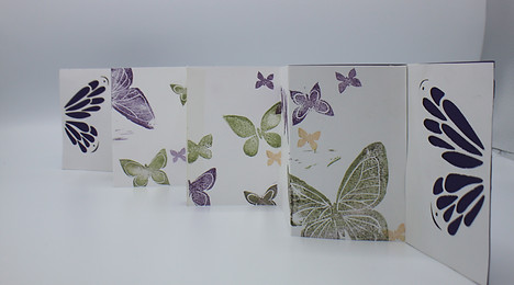
04
Butterfly Accordion Fold
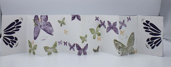
Rubber stamps, paper, laser cutter
This project is an accordion fold that has a theme of butterflies. Each page of the book represents a different principle of design. For example, the large butterflies represent emphasis, the big and small butterflies represent contrast and variety, and the little orange butterflies represent movement by color. The color harmony of this book is triadic – yellow-green, orange, and violet. Each butterfly stamp was hand carved, and the front and back cover were created using the laser cutter.


05
Stickers
5 x 6 in; Adobe Illustrator, paper
This sticker sheet is inspired by the coquette aesthetic. It is called "beary sweet delights."
06
Walk Two Moons
11 x 17 in; Adobe Illustrator
This design was a poster for a school play. The play is centered around a young girl's coming-of-age journey as she travels across the country with her grandparents in search of her mother. I decided to create a long path to show the main character's physical and spiritual journey, and I put a silhouette of a tree with a swing at the end of the path because it is an important symbol in the play.
